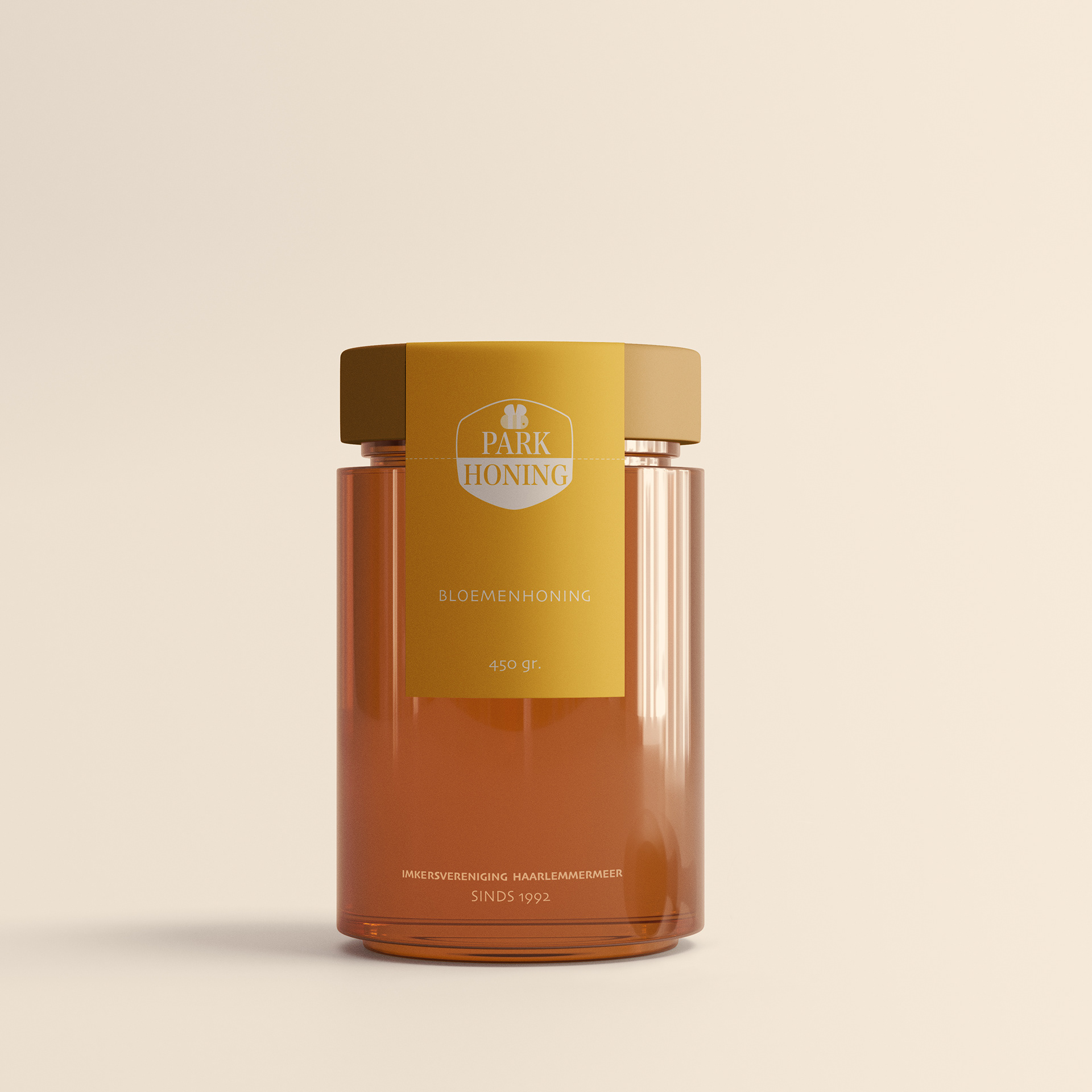
Often, during this Design learning process, I'll take a brand that I love, or simply one that could use a little "something" and play with the design of their product or branding.
This time, just for fun, I took my favourite local honey, and gave it a special touch, giving it a packaging and feel that to me, represents the quality of what they are doing. To soften up the feel, I made sure to take the existing logo, and make it front and centre "cutening up" the bee.
Simple, uncluttered with a feeling of quality. I know exactly what I'm getting.