This was a business card "upgrade" practice.
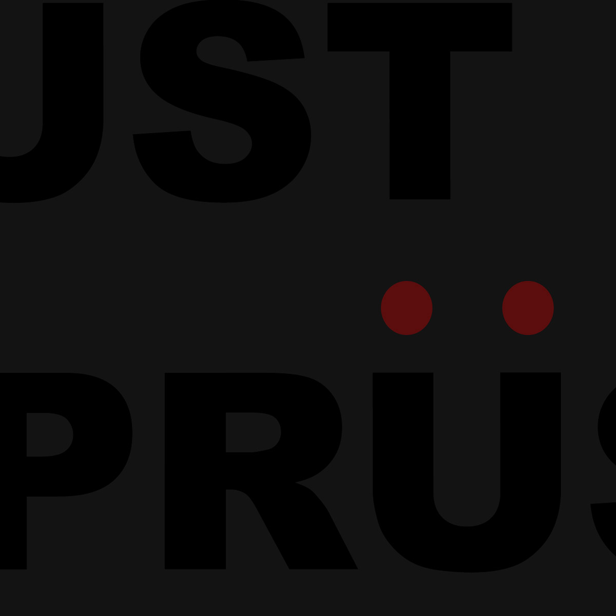
Sometimes the ideas for a design comes easy when you already have a strong base to begin. Marcs name includes an umlaut " Ü ", and he already used this on his website logo with a simple two red dots.
The decision to exclude an email address or phone number was an easy one, tell people what you do and where to see your work, when you have a product or service that's exclusively visual or has a strong visual relationship, you want to drive people to your portfolio. From there they contact you if you are a match for their needs.
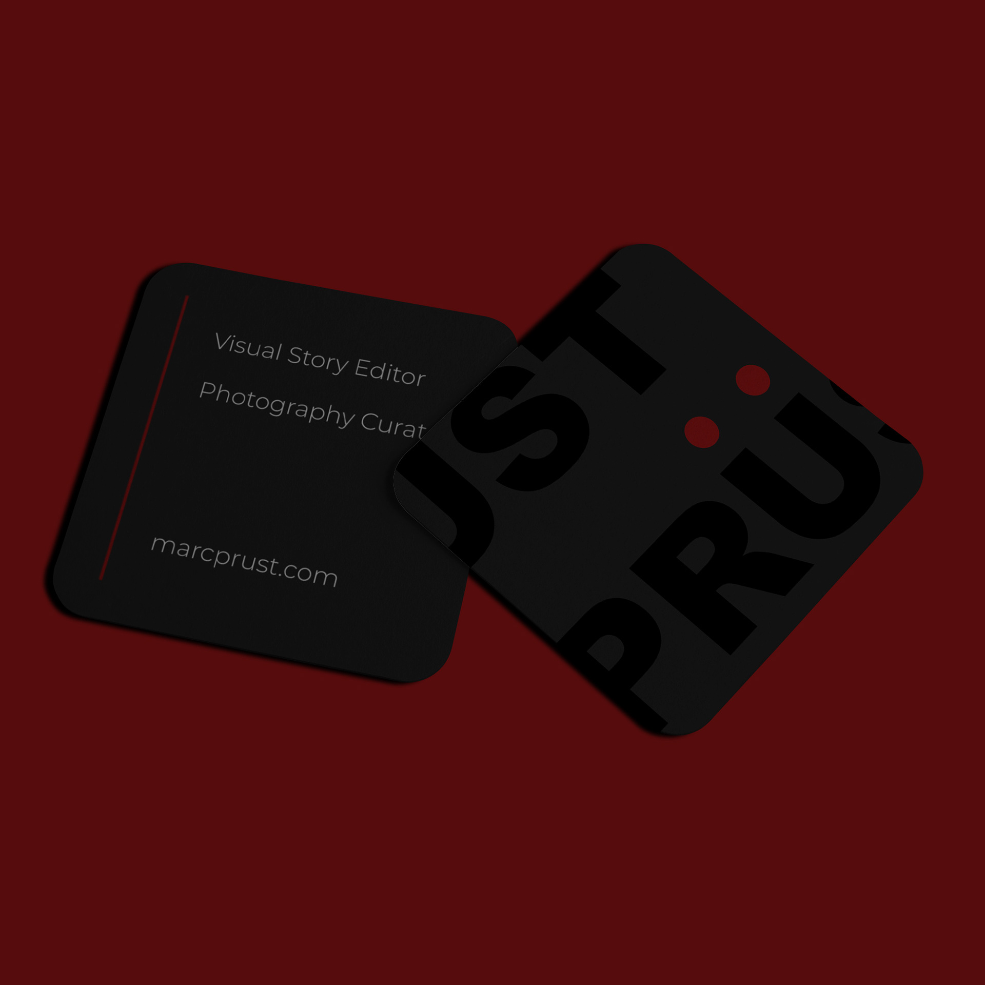
I've split Marc's surname, not only vertically but horizontally, creating the desired results, with a look that is stylish and simple. The bold lettering would be printed with a glossy finish against a matt background, highlighting them in a subtle way.